
Can You Visual-EYES It?
by Allie Cormier
Picture It: You walk into a room and your once bad mood dissipates before your eyes. You find yourself feeling the exhaustion of the day that had weighed you down is suddenly gone and relaxation settles into its place. So what happened? Well, you could be having an off day, or perhaps you just needed a moment to put on your rose-colored glasses and take in your surroundings.
As graphic designers, we’re trained to look at logos, cards, and websites and identify the visual message inherent in the design. A neon business card? They’re trying hard to make their card stand out when pulled out of a stack after a successful night of networking. But is it saying the right thing? Is the neon less memorable and more of a visual assault?
A rose-colored website might evoke a warm outlook for a site visitor/potential client. Many of the emotions a potential client feels toward a website or from a printed marketing brochure may actually be driven by the colors that one is seeing and associating with them. But did you know there is solid science behind all this?
We did. It’s our job to know.
The psychology of color is based on the mental and emotional effects colors have on sighted people in all facets of life. While some color psychology is by nature subjective, there are certain elements that present themselves time and time again. It is these near-constants that marketing and advertising agencies often look to capitalize on. Agencies employ certain colors to evoke specific feelings by their target demographic. While an individual will have their own personal preferences, often there lies deeper cultural significance toward certain colors. For example: A woman wearing a white dress might mean she is expressing the purity and innocence of a bride to one viewer, but someone else may see her as a woman mourning a loss. Research has been conducted repeatedly to find the best ways to influence audiences from various cultural backgrounds using colors alone, and due to consistent findings, the science of color now plays a significant role in branding.
Impact on Color Marketing is a frequently cited study relating to color psychology. That study’s research found that up to 90% of snap judgments made on products were based on color alone (depending on the product). The research boiled down to the fact that the colors and visual stimulation you take in on a daily basis affect you more than you realize. Certain colors tend to evoke certain emotions for many people, and if you’re curious as to what your brand may be saying about you (without you knowing!), we’ve found this fun Cheat Sheet for easy reference.
So now you have your references and your handy dandy Cheat Sheet, you may be wondering how it all ties in and how it all works together.
Never fear – we have you covered there, too. We here at LDM make it our business to know branding, and one of the benefits of working with a marketing and design firm (like us) is gaining all of this knowledge (without having to read a 20+ page research paper!).
 Lentini Design & Marketing’s logo — to start this example off — has a deep red as the main color and a yellow-gold as the accent color. Red is typically associated with being bold and passionate, and has a quiet strength associated with it. (You don’t see a shy woman wearing red lipstick, do you?) Gold is part of the yellow family – which lends itself well to optimism and creativity. Put it all together and our logo reflects our LDM team: passionate about being creative.
 Another example: the Society of Independent Workplace Investigators (SIWI): We designed their logo employing black, white, and grey. Black and white are complete opposites of each other – the absence of color versus a saturation of all colors. Did you know that grey evokes a feeling of neutrality? Is it a coincidence that the logo we created fits exactly the Society of Independent Workplace Investigators – who are a group of distinguished impartial investigators? Of course not! Our decisions were considered and thoughtful.
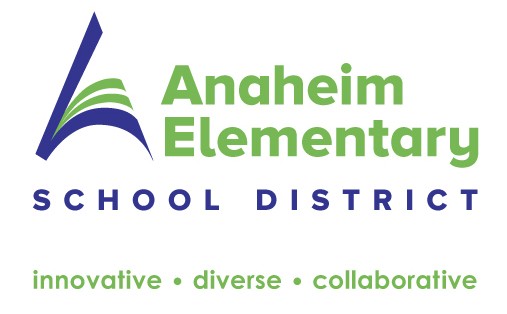 Our third example: Anaheim Elementary School District: Their color palette is blue and green for very distinct reasons. While we designed the imagery of the logo to imply the “A” for Anaheim, we also brought in the deep blue to invoke intellectual intelligence. The green implies new growth. When you send your child to school, shouldn’t it be somewhere that supports intellectual growth? We agree!
As a business owner, you need to remember that colors affect us all differently and that colors often align themselves with specific qualities. Your brand’s color palette should attract your ideal client. When you launch that daycare, bright primary colors that stimulate learning will lend themselves well. Opening a chic euro-bridal shop? Probably best to avoid neon yellow.
So close your eyes and take a moment, and imagine your brand and what feelings you want it to convey to your audience. Knowing what you now do about color psychology, you can see that the considerations that your marketing team (agency or in-house) have taken when working with color matter. So be sure and “visual eyes”. Or bring on a professional team to help you do that!
Sources:
http://www.arttherapyblog.com/online/color-psychology-psychologica-effects-of-colors/#.VzyRIJMrJlM}
https://www.psychologytoday.com/blog/habits-not-hacks/201408/color-psychology-how-colors-influence-the-mind
http://www.emeraldinsight.com/doi/abs/10.1108/00251740610673332
 Writer for this issue is Allie Cormier
Account Executive at LDM